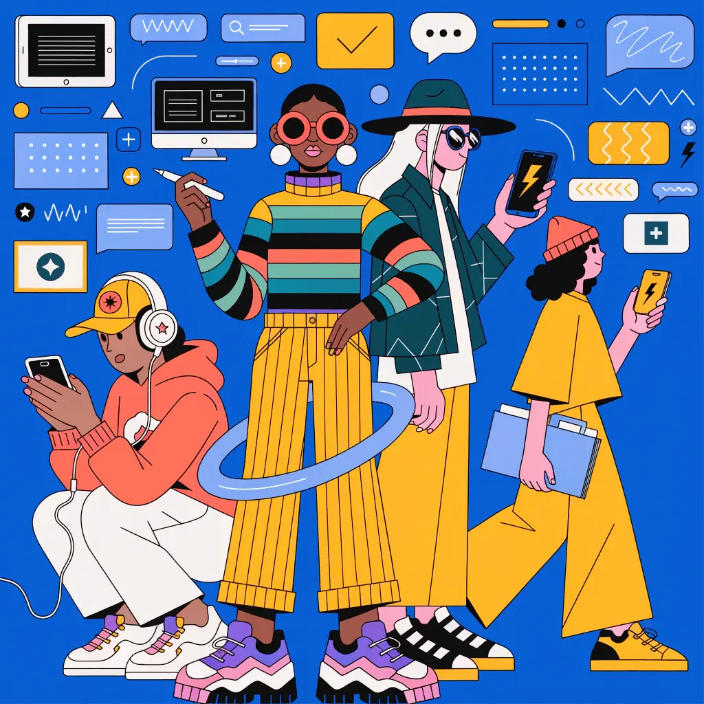
Digital product design has long suffered from a binary choice: burn budget on custom illustrations or settle for disjointed stock vectors. That second option usually results in a generic template look. Most startups die a slow death of mediocrity right in that gap.
Ouch, the illustration arm of Icons8, targets this specific void. It isn’t just an image repository. It functions as a library mimicking a custom design system. With over 101 styles-ranging from static PNGs to editable Rive animations and 3D FBX models-it positions itself as the solution for professionals needing scalability without the headcount.
Design leads face a simple question. Can an off-the-shelf library support a coherent brand system? Or is custom work the only escape from looking generic?
Systematization Over Volume
Platforms like Freepik or Shutterstock fail on continuity, not quality. You find a great hero image. Then you need a matching 404 page or checkout icon. The style vanishes. You mix line weights. You clash palettes. The user experience fractures.
Ouch solves this by organizing assets into style packs. Pick “Business 3D” or the geometric “Surreal.” You don’t just get five images. You get coverage for the full UX flow.
Scenario 1: The Fintech MVP
Picture a small team building a budgeting app. They need immediate trust. Budget for a brand agency? Zero.
Instead of keyword hunting, the lead designer picks one Ouch style. Let’s use “Tec” for its clean lines and tech metaphors.
- Onboarding: They download SVGs for welcome screens. Since they have source files, they shift the primary blue to match the app’s #0052FF hex code.
- Empty States: Launch day means no data. The designer grabs the “no data” illustration from the “Tec” pack. It matches the onboarding.
- Marketing: The landing page needs motion. They grab the Lottie JSON version of the hero character. Same style, now animated.
The product looks like it had a dedicated illustrator. Style consistency holds across UI, web, and animation.
Scenario 2: The Content Marketing Engine
A B2B SaaS marketing manager publishes three posts a week. Plus a daily social calendar. Custom art for every LinkedIn update isn’t happening. Stock photos of handshakes are forbidden.
This workflow relies on the Mega Creator integration. The manager needs art for a “Remote Collaboration” article.
- Open Ouch. Select a flat style matching the company tone.
- Default image: character at a desk with a plant.
- Built-in editor swap: Plant becomes a server rack. Now it fits IT.
- Combine with a background element from a different scene in the same pack.
- Export high-res PNG.
Decomposing illustrations into searchable objects-not just finished scenes-lets the team generate “new” on-brand assets. No drawing required.
A Day in the Workflow
Let’s track a real production environment. Take a Tuesday for a Senior UI Designer on a healthcare dashboard.
She opens her design tool. The “Appointment Success” modal looks sterile. She skips the browser. Instead, she opens Pichon, the Icons8 desktop app bridging Ouch to her OS.
She types “success” into the “Doctor” style pack. A vector of a physician holding a clipboard appears. She drags it straight to the canvas. It lands as an editable shape group.
The doctor’s coat is white. The UI background is light gray. Contrast is poor. She double-clicks, changes the fill to soft teal, and deletes decorative background blobs. Visual noise gone.
Total time: under two minutes.
Later, she needs a specific asset for a fitness feature. She grabs some gym clipart to match the health theme. Drag, drop, tweak. She stays in flow. No download folders. No import friction.
The Alternatives
How does Ouch compare to the usual suspects?
- Undraw: The open-source darling. Free and color-customizable? Yes. But it suffers from extreme overuse. Using Undraw signals “bootstrapped MVP.” Ouch brings more stylistic variety and artistic complexity.
- Freepik: Massive volume. Zero consistency. You spend hours matching a search icon to a header. Freepik suits one-off flyers. Ouch suits product ecosystems.
- Custom Illustration: The gold standard. Airbnb and Slack hire teams for this. For everyone else, Ouch delivers 80% of the value for 1% of the cost. The trade-off: exclusivity. You don’t own the style.
Limitations and When to Avoid
Ouch isn’t a magic bullet for every scenario.
The “Trendy” Trap
Some library styles are incredibly distinct. 3D hands and abstract characters have flooded the design community. Use these without modification, and your brand looks like a template. Safer bet: choose neutral styles or recolor heavily. Claim ownership of the look.
Niche Metaphors
The library is vast (28,000+ business illustrations), but limits exist. Building software for industrial agriculture? Maritime logistics? Generic metaphors won’t cut it. You’ll find “rocket ships” and “team meetings.” You probably won’t find “hydraulic press maintenance.”
Vector Complexity
Professional quality SVGs come with a catch. Artistic styles-textured or painterly-are complex. They contain thousands of paths and clipping masks. Manual animation in After Effects will require cleanup.
Practical Tips for Success
Integrating Ouch into your workflow? Follow these practices to maximize value:
- Never use defaults: That’s the easiest way to spot stock art. Even a subtle shift in the primary palette to match your brand guide makes the asset look bespoke.
- Mix and Match Objects: Don’t just download scenes. Use Mega Creator or vector software to combine elements. Take a character from Scene A. Place them in Scene B’s environment.
- Get the 3D Sources: Got 3D capability? Download FBX files, not PNGs. Render models with your own lighting and camera angles. That look is virtually impossible to identify as stock.
- Check Animation Formats: Before committing to a style, check for Lottie or Rive support. Pre-made animations for loading states save days of engineering time.
Verdict
Ouch bridges the gap between chaotic stock sites and expensive custom art. It answers the brand coherence question with a resounding “yes”-provided you stick to a single style pack. You must put in the effort to customize colors and compositions. For fast-moving startups and agencies, this is the most efficient route to a polished visual identity.


